Specialty Paint Finishes, Five Ways
When we took to designing our project in Los Feliz, we knew that wall finishes were going to be a major component of the space. The home’s contemporary lines and minimalist scheme needed texture to warm it up, and that wasn’t reserved for just details— walls were the largest canvases available. We partnered with our friends at Portola Paints on a simple palette of refined specialty finishes.
Great Room, featuring Roman Clay in Brooks
We’d used and loved Portola’s Lime Wash in West & Wild Yucca, but this project called for a little more refined finish: enter Portola’s Roman Clay! An “eco-friendly plaster” that mimics traditional plaster but with a lighter touch, we loved that it was made of natural materials, didn’t offset chemical VOCs, and was easy to apply. We tested out more off-white colors than we dare admit, and in the end, a double-pigment version of Brooks was perfect for the great room.
Hot tip: the lighter the Roman Clay, the more subtle it is. We found that the double-pigment treatment (which the friendly staff of Portola can easily provide) made the plaster finish pop.
POWDER BATHROOM, featuring Roman Clay in DARKSIDE
The vast majority of the project was a study in barely-there neutrals, but the powder bathroom was an opportunity to play with moody, dark hues: call us inspired by the dark master bedroom in Yucca, where we balanced softer design elements with Portola’s deep-toned Lime Wash in Guru. A Roman Clay color called Darkside was chosen to match the deep forest-toned zellige tiles— it’s no longer on Portola’s website (moment of silence for how long renovation projects truly last) but currently available Highland and Nitty Gritty look temptingly similar.
HOME OFFICE, featuring Roman Clay in SASHA
Between the built-in reclaimed Beechwood cabinets and white oak herringbone floor, the home office had plenty of natural texture, but the room’s limited sunlight had us wanting some shadowy, grey depth. Picking a grey was only slightly easier than picking the off-white, because staring at samples of available colors quickly reveals the undertones. We went with a subtly purple-toned, medium grey that Portola calls Sasha, and we had a good laugh at the pun nestled like an Easter egg in their name. :)
MASTER BEDROOM, featuring LIME WASH in BLONDIE
We broke from our mostly Roman Clay tradition to use a Lime Was in the master— we loved how its more roughly textured, irregular finish was more subtle in the white and beige space. Similarly to Roman Clay, Lime Wash is more visible in darker tones, and the color we went with the almost-white Blondie, so the finish is most visible when the light hits the walls indirectly. It works out perfectly for this space, which has one wall of west-facing windows.
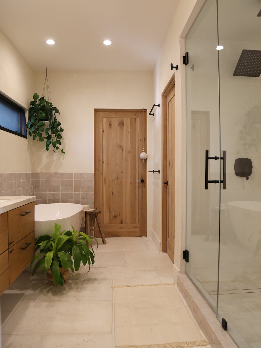
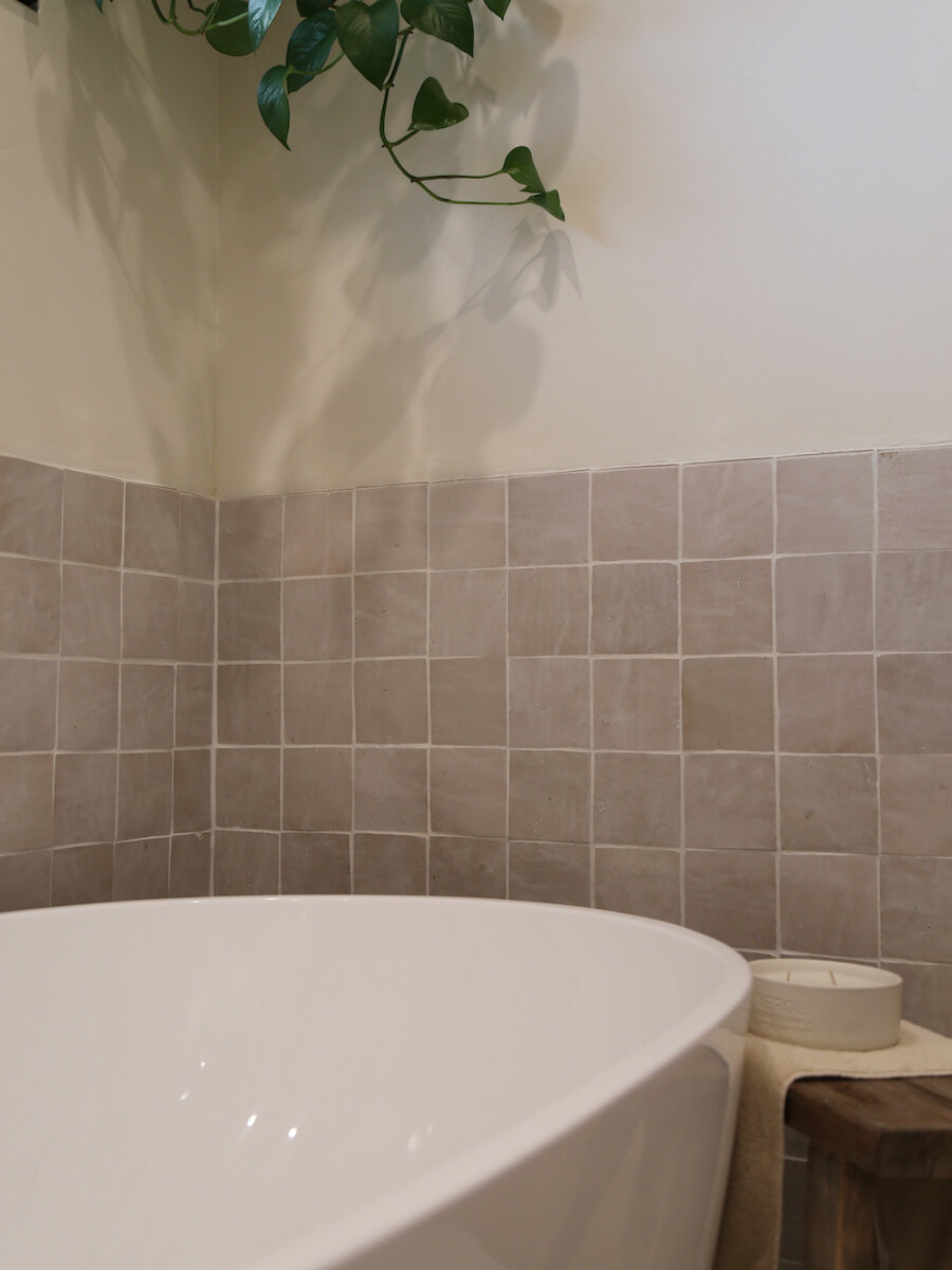
MASTER BATHROOM, featuring ROMAN CLAY IN BROOKS (AGAIN!)
So nice we used it twice, that double Brooks ended up being perfect for the master bathroom as well. The smoothness of the plaster finish looks appropriately Old World next to the zellige tiles and oversize pavers, and its subtle golden undertones warm up a room with limited natural light.


